LOVE THAT LOOK-- HAUL
I got a chance to check this new collection on Saturday….oh, well, I changed all my plans for Saturday, to check this collection. I was super excited for this collection, simply because last year I had tasted the buttery finish….didn’t wanted to miss any this time…
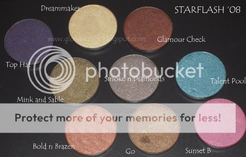
STARFLASH (COLOURS FROM PAST)
So, with 8 new shades and 4 repromotes, the collection did had something for everyone…from lovely neutrals, to smokey to lovely vibrant shades it had all…
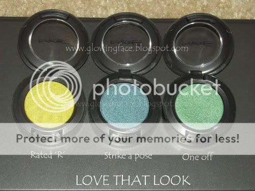
I was very impressed with the swatches of rated R on beauty blogs, but at store I found Strike a pose really striked!!
Its soo gorgeous….its blue…its teal…its not deep truth…its not deep blue green pigment,…its gorgeous!!!
It sure does belong to the blue-green family, but unlike Blue green pigment which turns Blackish on me..this retained its true pot colour on my lids…
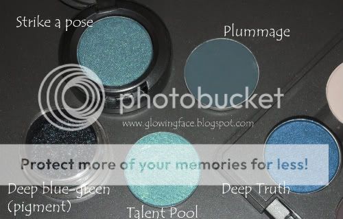
Deep blue green pigment, Talent pool, Deep truth, Strike a pose, Plummage
SWATCHES

Plumage, Strike a pose, Deep truth, Deep blue-green pigment
One off is well green…Its again not Wonder grass…not Antique green pigment…its just another green….I have a similar green from Stila Precious pearl palette…but again the crazy MAC addict in me had to pick it….I don’t even know how much I am going to use this green, but I had to have it…Its LE!!

Mildew, One-off, Humid, Wondergrass
SWATCHES

Mildew, Humid, Wondergrass, Green Space pigment, spiritualize, Scarab, One-off
Rated R is very similar to Sharp, but with better finish n sheen…its not close to Chartreuse pigment. Rated R has is more of a lime green with prominent yellow in it. People say its close to Bitter, but I don’t have Bitter.
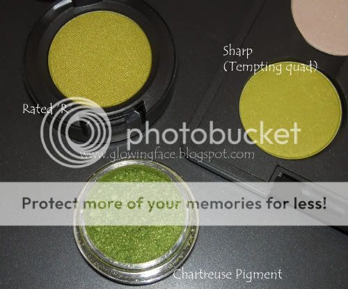
Sharp, Chartreuse pigment, Rated R
SWATCHES

Rated R, Sharp, Chartreuse pigment swatches
Fashion groupie was gorgeous…I mean amazingly eye-catching and dead similar to Satellite dreams, that is permanent colour. I wished they had changed the color of fashion groupie a bit….so that I could have convinced myself to buy it..
Other new colors like Unbasic white and Ego were not MY colours..I mean I don’t wear much of pinks and I dunno what exactly to do with a White…I had similar pink and white in Stila precious pearl palatte…that one stila palette was worth every penny!!!
The other two new shades Fashion and Style Snob were nice…but I would admit, I had prepared myself saying they were dupable…but now I think I should have paid more attention to those 2 colours and swatched them….
Btw, my MAC took depotted empties…and I cud B2M for 2 colours out of 3...:)
I dint pick any pearl glides…simply because I am very happy with my UD stuff and UD stuff are permanent…
All I can say....LOVE THAT LOOK........ROCKS!!!!!!
DISCLAIMER:
I didn't realise that the fonts I used to label the pictures resembled very similar to my fellow blogger and friend Xinarox, until she pointed out that it looked like her twin blog!!! I thought i will put on this disclaimer, before my supportive followers start pointing this out!!
As i have already marked a few more pictures using same font, you would see few of those in coming days...:)


No comments:
Post a Comment